I created a new battle arena for Konoko Payne. I did it in good old MAX 5, computed the lighting using good old Flexporter,and here it is! Turned out better than expected. I think I’ll continue and turn this into a full level.
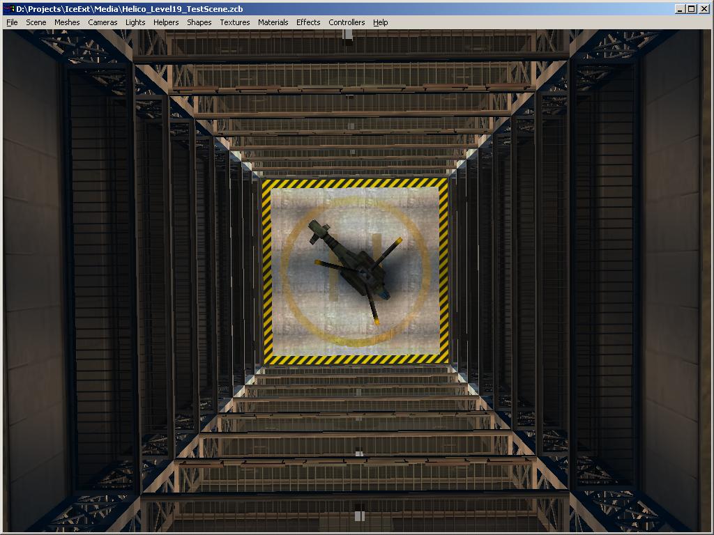
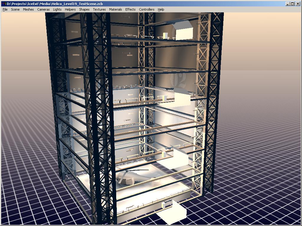
Top view: the platform will eventually go down from the top to the bottom of the structure. Inspired from the “shaft” level in GITS-Standalone Complex on PS2.
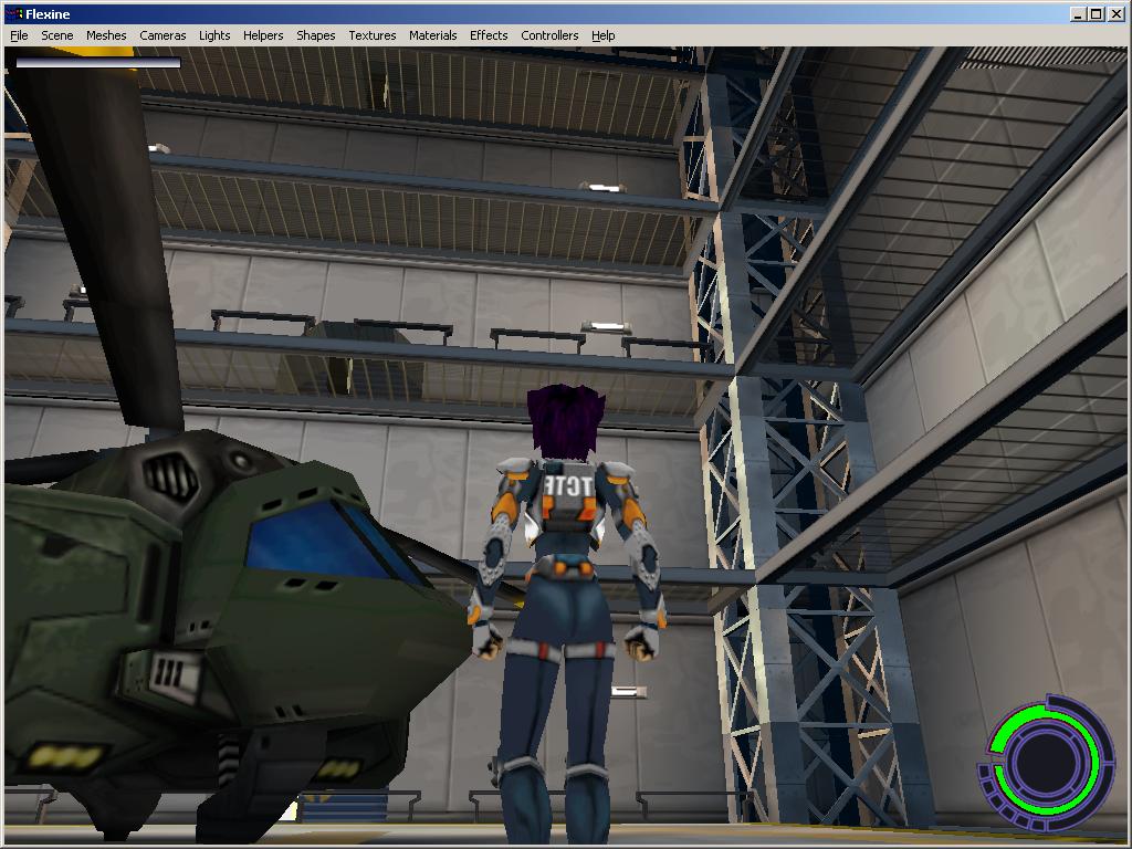
As a level in KP: I like the dark blue ambient mixed with the orange-colored lights. The helicopter is from Oni, level 19. I might create a better one eventually.
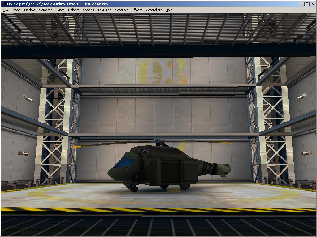
Side view: simple but efficient.
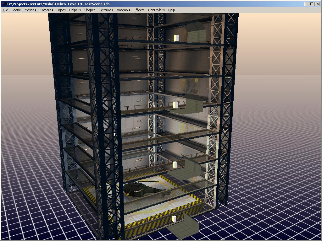
Overview in ICE, with or without textures. It’s plain old vertex colors, just like Oni. Some people find them obsolete and lame. I find them convenient and fast. I saw some so-called “next gen” engines looking way worse.
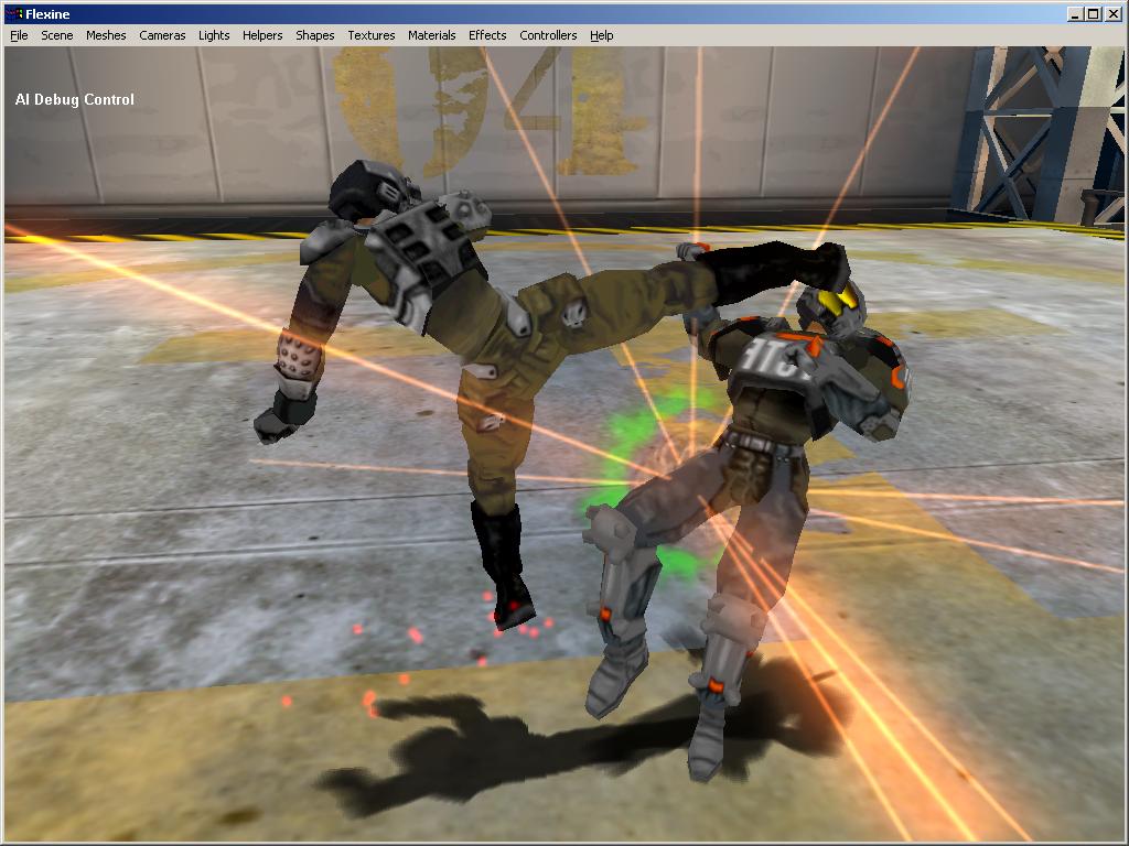
Used as a battle arena for KP’s demo mode:
May 20th, 2008 at 12:31 pm
Looks great! Will this ever be published for the mac though?
May 21st, 2008 at 5:40 am
It’s true that a lot of games tried to apply textures where Oni just had some basic colors, and ended up looking far worse when we look back on them than Oni does. Still, the textured version looks very nice.
I will second the request for a Mac version. I’ve never been able to get KP running in either Windows virtualization or full-on Windows via Boot Camp.